Tuesday 31 December 2013

Week 7: Text Layout and Typography Design (Adobe Illustrator)

This week, we continued on in our quest to master the Adobe Illustrator! The point of this lesson was to learn more about how to create the perfect wordings for our designs. This meant that we had to grasp the skills of text layout and typography design.


Text layout is important in organising the structure of your texts, and directly affects the visual appearance and usability of the text. To start off, use the text tool image 1 to create a new type area on a page, where you will proceed to type in in the future. From there on, after placing your desired text on the page, you can proceed to split up the text into smaller, more manageable columns, and even set how far do you want the distance between the text and the borders of the page to be. Of course, these are just some of the tricks to successful text layout, and all I can say is that I sure am glad to have learned this useful skill.

Setting your options:


Source: http://www.webdesign.org/img_articles/13677/06.jpg


For the other part of the lesson, we learnt about typography design, which has all about to do with the size and font type of your words. Sounds similar to what you would expect in Microsoft Office, and it actually is! However, instead of simply selecting the font you would like, you get to create your very own font! Be it a desired shape, size or texture, typography design allows one to change it all.

Typography is also very important for our upcoming CA, for it can essentially bring out the message behind your slogan or brand design. And as such, the trick to selecting and designing a font that does just that is all under the "Effects tab". Once you click that tab, you will notice alot of different options available to you, some of which include "warping" the text to create arcs, or blurring and distortion of the image. The choices in Adobe Illustrator are many indeed, and is definitely suitable to creating good typography design.

The process of "arcing":

Illustrator-tutorial-create-your-typographic-design-9.4

Source: http://files.bnetwork.netdna-cdn.com/wp-content/uploads/2013/04/Illustrator-tutorial-create-your-typographic-design-9.4.png


In a nutshell, this week had been eye-opening as well, as we were led further down the road of professional usage of Adobe Illustrator. As always, hands-on activities in class really livened up the atmosphere, and made for a great and efficient learning environment. It was a good week indeed.


Sunday 29 December 2013

Week 6: Introduction to Adobe Illustrator

This week marked the beginning of our learning and practice of the various Adobe software's. We started off with Adobe Illustrator, and learnt some of the basics to drawing pictures and such.

As an intro to Adobe Illustrator, there are some basic illustration tools that we were taught how to use. These include selection, direct selection, shape, colours, scale, pen tools, type, rotate, scale, place, ruler, guides, gradient, layer, type etc. I will talk about some of these tools in more details later on. There were also other important basics, such as saving our work, creating outlines, and not to mention, the very important "layers".

One of the key components to drawing a picture on Adobe Illustrator are paths. Creating paths are essential to determining the shape of the picture, and how u maneuver the path skillfully will in turn determine if you can create the picture that you want. A path is made up of one or more straight or curved segments. The beginning and end of each segment are marked by anchor points, which keeps the segment in place. A path can be closed (for example, a circle), or open, with distinct endpoints (for example, a wavy line). To change the shape of the segment, we use handles, which can be seen by hovering your mouse over the anchor points. By holding and dragging the handles, we can create curves and other desired shapes.

Here is a picture depicting some of these terms:


Components of a path
A.
 
Selected (solid) endpoint
B.
 
Selected anchor point
C.
 
Unselected anchor point
D.
 
Curved path segment
E.
 
Direction line
F.
 
Direction point

Source: http://help.adobe.com/en_US/illustrator/cs/using/images/sdw_path_components.png


As earlier mentioned, there is another very important tool in Adobe Illustrator, and that is the layer(s). Sometimes, as I found out the hard way today, a smaller item or picture can get overlapped or "hidden" by other larger items which were introduced into the drawing later. As a result, it can become quite difficult to isolate the item that you want, in order to do further touch-ups on it. What can we do? We set layers.

Setting layers is done through the layers panel, which can be accessed via the windows tab in Adobe Illustrator. There are four columns under the layers panel, although we only had to use 2 of them during tutorial. Those are the 1st and 2nd columns, which are called the visibility column and edit column, respectively. You can create new layers simply by pressing the "create new layer" button at the bottom of the panel. If you want to edit an item, without the hindrance of other items on the drawing, simply "lock" the layers with the other items( you do this by pressing the space beside the layers, under the edit column), and then uncheck the visibility column( make sure you don't see) for the other items' layers. You can now safely edit whatever and however you want, without having to worry about affecting other items on the drawing, or have them affect you. Its that easy!

All in all, this week was really fun and informative. Learning all about a new software, even if its just the basics, is akin to learning a new skill, and I am happy in the knowledge that I walk away from class with a new set of useful skills under my belt. Of course, it wasn't easy by any means, in learning this new skill, but luckily we had the guidance of a skilled and experienced teacher, who led us on with confidence and success.


Thursday 12 December 2013

Week 5: Logo and Mascot Design

 This week, we learnt about logo and mascot design.

Logo Design

Contrary to popular belief, a logo is not a brand. It is instead a design that symbolises one's organisation. Logos can be either purely graphic (symbols/icons) or are composed of the name of the organization (a logotype or wordmark). And as such, there are three different types of logo designs. They are either iconic/symbolic, logotypes/wordmarks, or combination marks.

Iconic/symbolic logos are efficient because they are instantly recognisable, as the images used are often easily eye-catching and memorable. When printed and produced in small sizes, an image is also more easily seen clearly, as opposed to words. Finally, they can also be illustrative in nature, and can be either concrete or abstract.

Here are some examples of well-known iconic/symbolic logos:

Source: http://speckycdn.sdm.netdna-cdn.com/wp-content/uploads/2011/05/30FamousLogos_30.jpg


Source: http://static.getkempt.com/photos/assets/lacostelogo_crop.jpg


A logotype/wordmark logo is an uniquely-styled type of font treatment. This type of logo is good because they are easily legible, and can ease recognition in the target audience. (Some interesting pointers to note: Script fonts imply a sense of formality and refinement, thick fonts proclaim strength and power, while slanted fonts impart a sense of motion or movement.)

Some examples of logotypes/wordmarks:


Source: http://imgs.abduzeedo.com/files/paul0v2/minimalist-logotypes/logotype-01.jpg


Source: https://assets.mozillalabs.com/Brands-Logos/Firefox/wordmark-only/firefox_wordmark-only_RGB.png


Finally, there are the combination marks. These types of logos consists of concise text that can implement an icon or symbol, providing additional clarity. Combination marks can also be either integrated, or stand-alone, meaning the text can either be incorporated into the logo, or put beside the logo.

Here are some examples:


Source: http://socialventurepartners.org.s3.amazonaws.com/www.socialventurepartners.org/sites/40/2013/11/SVPlogo_Global-Combination_Black---Fill_RGB_600x127.png


Source: http://edss.weebly.com/uploads/1/3/2/3/13232001/6913283_orig.jpg


Besides learning about the different types of logos, we were also taught the 5 key principles in logo design, and that is the logos having to be simple, memorable,timeless, versatile and appropriate. With this in mind, we were then tasked to find 2 examples of good logo designs for each of the 3 different logo design types.

                                                           And I hereby present to you:
Iconic/symbolic: World Wildlife Foundation (WWF)
                                               
                                  Source: http://artisanart.ro/wp-content/uploads/2011/02/13.jpg

This logo catches my eye because it is something that everybody knows: A panda. The design is classic, and that's just where its beauty lies in: Its simplicity and appropriateness. This logo is both appealing and memorable, and thus makes it very efficient.


 Iconic/symbolic: McDonald's

                                                 
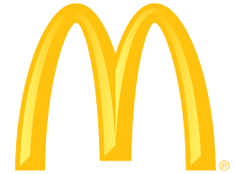
       Source:      http://www.franchisingexpo.com.au/files/editor_upload/Image/McDonalds_logo[1].jpg

Speaking of classic designs, here's one that should be unfamiliar to nobody. The iconic logo of McDonald's has aged with us throughout our growing years, and yet remains ever-appealing and eye-catching. Simple and sweet, here is a true example of a timeless logo.


Logotype/wordmark:
                                     
               Source: http://apex.aero/Portals/0/TVMC%20logos/Disney%20PSD%20Logo.png


The famous Walt Disney logo not only incorporates well-fitting font type with its theme of cartoon entertainment, it takes things one step further by using different colors for its logo, at different points of its existence, in order to constantly keep a "fresh" and memorable image. Shown here is just one of the many colors that the logo had used.


Logotype/wordmark:
                                               
                      Source:http://www.famouslogos.org/wp-content/uploads/2010/12/google1.jpg

Yet another famous logo, Google's wordmark incorporates much of what makes a successful and effective logo: Simplicity and memorable. Not to mention the name itself is funky and interesting, and the variety of colors used further amplifies the effect. All in all, a good logo that is able to stay etched into peoples' minds.


Combination mark:
                                              
         
 Source: http://www.logodesignconsultant.com/images/Logo-types-example-combination-mark-logo-design.jpg

The bright colors used in Burger King's logo is appropriate indeed, as they signal a light and fun mood, which fits the idea of having a good time in this fast-food restaurant, enjoying a meal. The combination of the words and the logo does not feel awkward, and in fact makes it even more appealing and eye-catching, making for great effects on the target audience.


Combination mark:
                                            Captain High Country Charter

                       Source: http://www.mdesignmedia.com/wp-content/uploads/Screen-shot-2013-09-23-at-                                                                     7.11.25-PM.png


Another simple and appropriate logo, it clearly show what the service or organisation is about, and will definitely appeal to their target audience.


Mascot Design

As earlier mentioned, we also learnt about mascot design. A mascot is a representative figure, a symbol and communication tool for somebody or some organisation/campaign/product. A mascot is aimed to personify their values, as well as to communicate effectively and help them to stand out from the crowd.

The qualities that make up a good mascot are as follows:
1) Connection to a company profession and values
2) Background story
3) Appeal
4) Style for target audience
5) Props and accessories

Having said that, here are some examples of good mascot designs:

                                                                          M&M's

             
Source: https://blogger.googleusercontent.com/img/b/R29vZ2xl/AVvXsEj6Ct_TCQoW2v4l6OBgs-BBmra203-duZXEmLEr0VoFsxqWBkrRXIAgJtPmHpMBqCENnaVTrncdw5CAdHolbd7T-6Z5ZPs9nQtuXq7kLzHv36Dgrecmgs1GQ6dtlOaf2eh4w7qqeXFBV7GJ/s1600/mnm-mascot.jpg


                                                      2012 London Olympic's Mascot


Source: http://cdn2-b.examiner.com/sites/default/files/styles/image_content_width/hash/43/50/4350abedf2786c1d33434486620aa43d.jpg?itok=n21XdcVk


In conclusion, this week was very fruitful indeed. We learnt all about how good logos work, and how to make them. This is especially useful since our upcoming CA will be all about designing our very own logo and mascot. With my newly armed knowledge, I must say, I can't wait!


Wednesday 11 December 2013

Week 4: Storyboards, moodboards and Art Nouveau

This week, we learnt all about storyboards and moodboards.

Storyboards are visual organisers, typically a series of illustrations displayed in sequence, for the purpose of pre-visualising a video, TV/cinema commercials, web based training, interactive media or design concept sequence.

Similarly but yet different, a moodboard is a type of scrapbook that may consist of images, texts, fabrics and samples of an object in the composition of the choice of the moodboard director.

And, also, before we went on with learning these two terms, we were first introduced to poster histories, and did a bit of research on an related art movement, namely the Art Nouveau.
The Art Nouveau is an international philosophy and style of art, architecture and applied art, that were most popular during 1890-1910. The term 'Art Nouveau' is French for new art, and German for youth style, so basically, one can say that 'Art Nouveau' is the ancestor of modern pop art, such as poster arts.

Here are some intersting examples of Art Nouveau,
Source: http://www.interiorholic.com/photos/Art-Nouveau-decorating-style.jpg

Source: http://thumbs.dreamstime.com/z/art-nouveau-pattern-collection-17921308.jpg
Source: http://media-2.web.britannica.com/eb-media/93/150193-004-472D11D4.jpg

Personally, I feel that this lesson really opened my eyes to the world of Visual Communications. From learning about one of the oldest forms of modern art, to understanding what a typical graphic designer does for work. This will definitely come in handy should I consider such a job for my future perspectives. The lesson was also well conducted, and allowed me to fully understand the various concepts learnt during the tutorial.


Week 3: Graphic Design History

   This week's tutorial was on graphic design history. There are two parts to this, namely the history of symbols and typography history. To start things off, I'm sure everyone know what symbols are, and that is as as a universal means to convey unspoken and unwritten messages. Basically, symbols function as an "alphabet of human thought", and as such is unhindered by barriers such as language and education. Of course, there are many forms of symbols, and some of which we learnt include pictograms, ideograms, Rebus, logotypes, trademarks and corporate identities.

Below are some examples of each:

Pictogram:

Source: http://www.1stwebdesigner.com/wp-content/uploads/2010/04/minimal-free-icons/dot-pictograms-icons-for-minimal-style-web-designs.jpg

Ideogram:

Source: http://fc01.deviantart.net/fs48/f/2009/223/e/4/Ideograms_by_Archeleron.jpg

Rebus:

Source: http://www.xkgfs.com/images/example-of-a-rebus-story.jpg

Logotypes:

Source: http://fc03.deviantart.net/fs23/f/2007/328/5/e/Logos_And_Logotypes_III_by_deleket.jpg

Trademarks:

Source: http://www.hhlegaladvisors.com/blog/wp-content/uploads/2012/12/US-Firm-Applying-for-Trademark-in-Thailand.jpg

Corporate Identities:

Source: http://blog.epromos.com/images/corporate-identity-sample.jpg

Next up on the list was typography history. To summarise, we learnt about the historys of printing, as well as the origins of various types of fonts that we commonly see in day-to-day life, such as in Microsoft Words.

Last but not least, we learnt about basic photography, which taught us to take better photos with our mobile phones and DSLR cameras. All I can say is, it is harder than it sounds! There were apparently so many "hidden" aspects to photo-taking that none of us knew before, such as the right composition, angle and lighting. And as a task, we were assigned to take some photos for each theme, and we were only allowed to take photos inside and near the school compound. The themes are Lines, Rule of thirds, Simplicity, Balance and Framing. And without further ado, here are some of them!

Lines:


Balance:


Rule of Third:


To wrap it up, this week's lesson was dynamic and engaging indeed. The hands-on activity was very interesting, and we also got to learn more about things we encounter in everyday life. Of course, it is hard to fully absorb so much information all in one go, as I am already forgetting some of what I had learnt. Thus, it is important to revise my work, and I shall also incorporate what I had learnt in my daily life. Such as taking better pictures!


Saturday 4 May 2013

Week 2: Textures and Perspectives

This week's lesson was regarding textures and perspectives. The above-shown picture is 3 different drawings of visual textures. The topmost drawing is one that represents me. If one looks closely enough, you can make out the words of my initials,'wyf'. The second drawing is one that was taken from my surroundings at the time when I was drawing it. This drawing was actually of one of the floor tiles in the room I was in. Last but not least, the third drawing is one of a futuristic/modern creative texture, and as you can see, my drawing is somewhat of the outer space, with its moons and stars, signifying that in the future, man may just be able to explore the far stretches of this reality.

This drawing is one of perspective, which was the other topic which we covered this week. For this particular drawing, my point of sight was in level with the scene before me, which was our school's link bridge. This resulted in a relatively easy perspective drawing, or so to speak; because for an amatuer like me,who had never attempted a perspective drawing, this still proved to be an daunting task for me. Nevertheless, I managed to finish the drawing, to a certain degree of personal satifaction.

Tuesday 23 April 2013

Week 1: Sketching and Shapes


  • This first Visual Communication lesson was really an eye-opener. We learnt various techniques to draw a given object or picture accurately (or as accurately as an amateur artist, such as me, can possibly draw). It definitely was challenging, but it was also at the same time, interesting and allowed me to have a insight on how a professional artist might go about doing his work, as well as view any art piece that I have came, and going to come, across in my life in a new light.
  • For this project as shown above, we were supposed to draw another classmate, using one of the many techniques that we were taught. As you can evidently see, I had not yet master it very well, and my drawing...did not quite hit the mark(hopefully the model is not too mad...). This particular technique was to use the pencil as a measuring stick to find the right angle to draw something, and although i grasp the concept,albeit slightly, it was quite a different story when I tried to actually implement it in my drawing. What was more confusing was the ratio of body to head part that you were apparently supposed to be able to gauge with this pencil technique...Nevertheless, as mind-boggling as this technique is to me as of now, I will definitely do my best in the upcoming lessons to perfect it as well as I can.

   How does my Kungfu Panda look? Do you think it looks like the original picture? Ya me neither. As you can see, I have yet to fully master the technique of using shapes to draw a picture accurately, but I have nevertheless managed to at least incorporate this technique in this drawing, by finding similar shapes to various parts Po's body.
Another drawing utilising the above-mentioned technique. If you ask me, I actually think this one is drawn slightly better than Po, maybe because this particular picture is easier than the other.(By the way, sorry for the bad paper quality...)
For this exercise, we were supposed to observe the lines in someone's signature, and (try to) make an exact copy of it. Easier said than done, I can tell you. As beautiful as the original signature is, I found it quite hard to appreciate it while I was trying to copy it, as the numerous lines and sudden u-turns made me feel like I was doing a level-99 maze. But still, all's well that ends well, and my final masterpiece seems almost identical to the original. Right? Right??What? No??

For this drawing, we were supposed to use a variety of the techniques we learnt, including shape, lines and thickness. It defintely was challenging, but is nevertheless a fun experience.
 

Last but not least, we again have a shape-drawing exercise. In case you can't really make out what I was drawing(sorry for the blad quality), I was trying to draw the 12"male manikin. Nothing much to be said, as once again we were to utilise the 'shape-drawing' technique.